 |
 |
|
|
Preamble
In his little book, "The 1965 Australian Coin Varieties Catalogue",
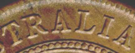
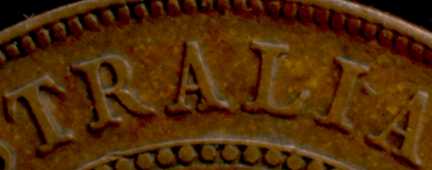
John Dean describes a particular variation on the reverses of Australian George
V pennies. This variation affects shape of the letters forming the legend "COMMONWEALTH
OF AUSTRALIA". On some coins the seriffed letters I, H, T, M, L , E, A and
R have flat bases whereas on others the bases of the letters are distinctly concave.
Dean also mentions this variation on the 1931 florin.
 |
 |
According to Dean's catalogue, the curved/flat-base lettering occurs in George V
pennies as follows:
|
|
|
As a novice I have not (yet) read much Australian numismatic literature but it
seems to me that this easily-discernable variation in lettering types has been ignored
by numismatists, variety seekers and catalogue compilers alike. That struck me as
odd, and still does.
Because of my interest in die varieties I had ordered back issues of some journals
of the Australian Numismatic Society and the Numismatic Association of Australia,
largely to read about Paul Holland's work in classifying penny and halfpenny varieties.
I couldn't believe that Paul would ignore the subject and I was curious to see what
he had to say.
At about the same time as I ordered the journals, I had been examining several
George V florins under the microscope and I had noticed a similar variation of lettering
styles. Reflecting on the similarity, I had formed a conjecture as to how the florin
variety arose and wondered if it might apply to the pennies as well. My curiosity
about Paul Holland's treatment of the subject was intensified. When the journals
arrived early in January 2000, I was rewarded with the following observation (JANS
1993 page 16):
... it should be noted that significant variations also occur in the shape of the lettering on the reverses of George V pennies. In John Dean's earlier work ... these were classified as "flat base letter" and "curved base letter" reverses. While some of these variations may have arisen during the striking of the coins, some are so pronounced and prevalent that it seems likely that they arose during some earlier stage in die production (i.e. at the level of hubs used to prepare working dies or from derivative master dies.) ...Paul's remarks do not contradict my conjecture, and even go so far as to support them. If he had said much more, he would have given the explanation himself. Since he did not, I am emboldened to publish.
The questions
The aim of this document is to offer an answer to all of the following questions:
How did the different letter shapes arise?
It is the premise of this document that flat-base letters are the original form
and that curved-base letters are a deviation which arose through differential plastic
flow of metal under pressure. This premise will be examined in more detail later.
Why do all early (pre-1919) pennies have flat-based letters while all later
(post 1923) pennies have curved-base letters?
This is really a subject for more research. At the moment I offer the speculation
that curved base lettering developed progressively during the production of derivative
master dies.
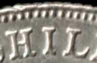
Why is the 1931 florin the only one to show curved-base letters?
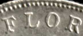
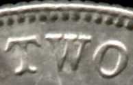
It isn't. In the preamble I hinted at the answer to this question. Although John
Dean mentioned it only for the 1931 florin the variation can be observed on other
florins. To be fair, the curvature on most florins is slight whereas on some of
the '31 florins it is very pronounced:-
 |
 |
 |
Curved-base lettering has only been documented (by John Dean) George V pennies
(and the '31 florin). The lettering on the coins of George V is characterised by
wide serifs so any curvature in the bases of those letters is clearly visible. Later
issues have legends with sans-serif lettering so any curvature is less visible.
Also, according to the conjecture set forth in this document, the serifs play an
important role in the development of the curvature.
Why is the variation not observed in halfpennies and other coins?
If one accepts the differential plastic flow hypothesis (which is still to be
explained) then one would expect curved-base letters to occur in a wide variety
of coins rather than be confined to the pennies.
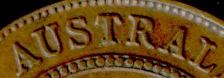
This expectation is confirmed by observation. If you look at a selection of pre-1940
halfpennies under a microscope, many of the coins are seen to have curved-base letters.
 |
I have already mentioned that I had observed the curved/flat-base letter variants
in florins and it was that observation which led me to this conjecture. Follow-up
observations revealed that curved-base lettering and various similar deformations
attributable to differential plastic flow can be seen in coins of all denominations,
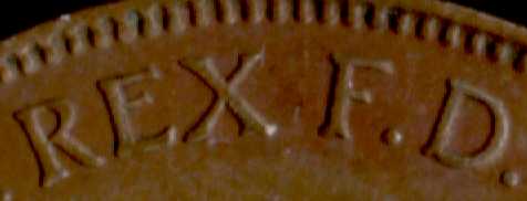
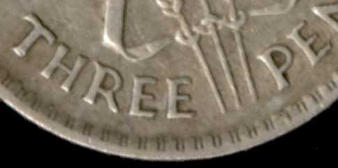
even threepences, throughout the entire pre-decimal era. Furthermore, the phenomenon
is not confined to the reverse legends.
 |
Curved-base lettering on a 1935 ½d obverse |
 |
Curvature on the tops of the letters on a 1938 threepence. |
Plastic flow
When a coin is being struck, the flat metallic blank (planchet) is subjected
to such high pressure that the metal behaves like a viscous liquid and metal flows
from the field portions of the coin to the relief portions. This is the mechanism
whereby the design cut on the surface of the die is transferred to the coin.
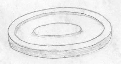
Just as an example, assume we're going to make a "coin" with an extremely
simple design, like this:
 |
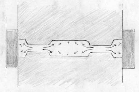
The next diagram shows, in cross-section, a pair of dies pressing a planchet.
The arrows represent the flow of metal from the field portions to the relief portions
of the coin during the strike. The flow is grossly exaggerated but I am attempting
to illustrate how metal is squeezed from the field portions of a coin into the relief
portions. (If I had the artistic skills I could produce an animated diagram but
for the moment I have to inflict this one on you. Sorry.)
 |
Real coins have more complex designs and in much lower relief but the principle
is the same.
Now let us digress for a moment and imagine the effect of striking a planchet
with perfectly flat dies. If the diameter of the planchet is such that it fits snugly
in the collar, then not much will happen when the planchet is struck. Should the
diameter be somewhat smaller then the planchet will spread under the pressure of
the strike. This means that there is a general flow of metal from the centre towards
the rim.
There is some observational evidence to suggest that such outward flow occurred
during the minting of Australian pre-decimal coins. The evidence is most visible
on high-grade silver coins but can also be seen on bronze issues and takes the form
of radial strain lines running from relief features towards the rim, especially
and most significantly rim-side of the legend.
[Within the next month I'll be able to provide a picture.]
The strain lines appear to be formed when the metal flows beneath the lettering
while the metal forming the letters themselves is held in place by the die.
Differential Plastic Flow
If the flow of metal from the field to the relief portions of a coin under the
pressure of striking is combined with a general rimward flow of metal then the pattern
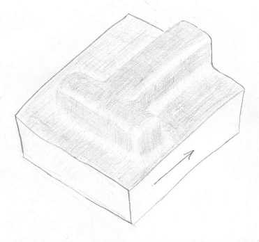
of flow will vary according to the contours of the die. Let us examine what would
happen to the metal in the foot of a serifed letter T such as found on George V
coins. The diagram below shows a cutaway portion of a coin featuring just the bottom
part of the letter. The arrow represents the direction of metal flow (assuming that
there is indeed such a flow).
 |
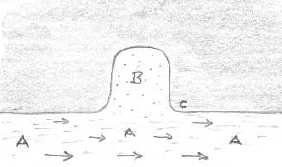
Imagine a cross-section through the serif of the T during coining when the die
is in place and the metal flow is occurring. In region A the flow is unconstrained
but in region B the metal has nowhere to go; it is held in place by the die. The
result is a shear zone between regions A and B where the metal in A slips past the
metal in region B. The surface metal in region C develops strain lines which can
be seen under magnification.
 |
Now imagine a cross-section through the stem of the T.
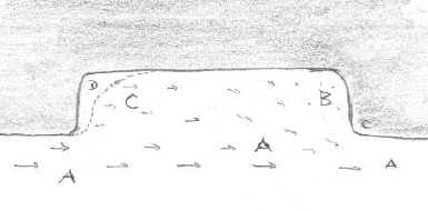 |
As before, the metal in region A is unconstrained and the metal in region B cannot
move because of the presence of the die. However there is a stronger tendency for
the metal in region C to be dragged along with A because there is a much longer
contact zone between the metal in the letter and that in the substrate. The result
is that there is a tendency for the metal in the stem of the letter to flow along
with the metal below, forming a separation zone, D.
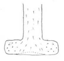
Looking down on the letter we see that whereas the metal in the stem of the T
is able to follow the overall flow, that in the serifs cannot. There result of this
differential plastic flow is that the foot of the T develops a curvature.
 |
From the foregoing explanation, it would seem that the development of curved-base
lettering occurs during coining. There are some difficulties with such a conclusion.
Firstly, it requires that there be an outward flow of metal during a strike.
That can only happen if the blank is significantly smaller in diameter than the
finished coin or if there are significant relief features around the edge of the
coin to be filled by the strike. It is unlikely that small-diameter blanks were
ever used; the rims would be obliterated during the early part of the strike and
then have to be re-formed by plastic flow during the latter part of the strike.
The only relief feature on the rim which needs to be formed is the beading and the
volume of metal therein doesn't seem to be great enough to provide sufficient flow
to induce much curvature in the letter bases. (That is a purely intuitive assessment
and subject to correction.)
Secondly, it is not clear that the strain lines observed on high-grade coins
were actually formed by plastic flow during the strike. Close examination of the
strain lines suggests that they may really be imprints from the die!
Until now, this whole conjecture has been built on observation and on inferences
drawn from observation but I have just made a completely unsubstantiated but pivotal
statement and the remainder of this document must be treated as purely speculative
until such time as I have had a chance to examine some of the dies and punches.
So what really happened?
The whole differential plastic flow conjecture hinges on the outward migration
of metal during a strike. While there is probably some outward flow as rim beads
are formed, it is (intuitively) unlikely that there would be sufficient flow to
account for the degree of curvature exhibited in some coins (e.g. the 1931 florin
shown earlier). Whereas some curvature may occur during a coining strike, it is
likely that the principal cause lies elsewhere.
Dies are made from punches (hobs) in a hobbing press and punches are made from
dies. Suppose you want to duplicate a master die. You use it to create a punch and
then use the punch to create another die. This process is quite common and is frequently
used to change the date on a coin. Take a 1933 punch, carefully shave off the last
3, make a new "193_" die and then hand-punch or engrave a 4 onto it to
make a 1934 die.
What happens in a hobbing press is significantly different from what happens
in a coining press. The pressure is greater (because the metal is steel rather than
one of the softer coin alloys), the strike is very much slower, and there is no
collar to prevent spreading.
The following diagrams are taken from page 163 of Cooper, Denis R., The Art
and Craft of Coinmaking - A History of Minting Technology, (Spink & Son,
London, 1988).
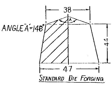 |
Fig 168 Stages in the hobbing of a working die. |
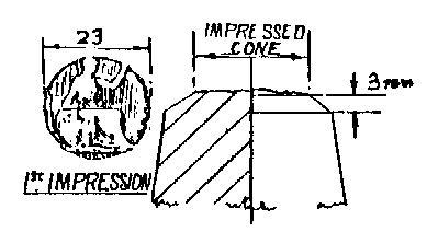 |
(1) First blow impression. |
 |
(2) Annealing |
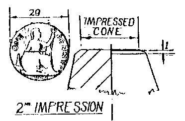 |
(3) Second blow impression. |
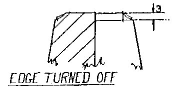 |
(4) Frustum formed. |
 |
(5) Re-annealing. |
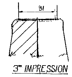 |
(6) Third and final blow. |
Now we come to the end of the matter. The pressing of a punch from a die is analagous
to the striking of a coin except that there is ample opportunity for unconstrained
radial plastic flow. In conjunction with the serifs and other limiting features,
the opportunity for differential plastic flow arises, generating curvature of letter
bases and similar deformations in the process.
Further investigation
The single most interesting thing to do now would be to inspect any applicable dies
and punches to determine whether they show curved-base lettering. Another thing
to check would be the existence or absence of strain lines near the periphery of
the tool.
Another interesting study would be to try to correlate the curvature with die
production but that is probably better left until after any inspection.
Should the dies and punches for a year in which the coins exhibit curved-base
lettering show no evidence of such letter forms then it would strongly indicate
that curvature arises during coining.